A full visual refresh for a local equipment rental business, including a logo redesign, pricing brochure, and more consistent social media branding.
The existing brand lacked consistency, making it harder to communicate professionalism and trust. The logo felt dated, the pricing was not easy to scan, and the social media presence was minimal.
That meant the business was missing opportunities to attract new customers and present its services more clearly.
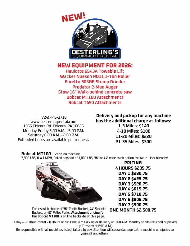
I started with a logo redesign that modernized the brand without losing recognizability. From there, I built a structured pricing brochure that made rental information easier to understand.
I also refreshed the social media presence with more consistent branding, clearer visuals, and stronger overall cohesion across platforms.
The final result is a stronger and more unified brand system. The updated materials improve clarity, trust, and day-to-day communication with customers.
This project reflects my ability to work with real clients and balance branding, usability, and business goals across multiple touchpoints.